ShopDreamUp AI ArtDreamUp

Deviation Actions


Suggested Deviants


Suggested Collections


You Might Like…


Featured in Groups

Description
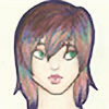
Stock [link]
Corrected [link] ~UiaBird
I'm sorry if any of my correction seems harsh. I am just trying to help. This is in no way, the right or only way to do things, it is simply how I draw, and how I think you could be helped. I realize I have probably made some mistakes myself in this drawing. I know I have. I am not perfect, and I am not a professional. I am just trying to help my fellow artists.
General Pose Her face, was facing the right direction, but her neck was a little out of place. Her shoulders were a little too wide, and not quite even. To help with posing in general, and to help keep things even, I use little helping lines. In the drawing I have labeled general pose, it shows some of the lines I use. Your torso was alright, although it lacked detail. Her hips, are not tilted quite in the right way, and I believe they are a little too slim. One of her legs it obviously smaller than the other, and it is the one that in the stock, is going over the other leg. With the other leg being larger, it gives the feeling that it is the other way around. Her arms are awkward, as well as her hands, and the one are that is dangling seems a bit too long.
Face and Hair It looks as if you got all the facial features in the right place. Good job! But the eyes are a little too big. I couldn't really see the detail on the nose very well. The lips are okay, although they look like they were drawn on a face looking directly at you, instead of pointing to the side a bit. Her hair looks kinda like one big mass. Hair is individual strands, although I don't draw every single one, I do add a bit of detail. It also looks like you completely forgot the part in the hair. She has an obvious one in the stock, so don't forget it in your drawing.
Final Pose In the final pose, I did change some things that weren't in the original stock, like I tilted her shoulders, more than was shown. I widened her hips a bit also. (Due to the fact that the model has very small hips) But, even with the few changes I made, I hope you can see the general idea.
Shading When it comes to shading, it just matters where your light source is coming from. With the model, it looks like the light is coming from the front, but I often make the light sources off to the side, since it is much more simple to shade that way.
Well, I hope I could help. Sorry again if any of this seems harsh. I really am just trying to help.
Well, have a nice day,
Your shady friend,
Ruby Stone
Image size
3000x2935px 1.49 MB
© 2013 - 2024 RubyStone11